Branding
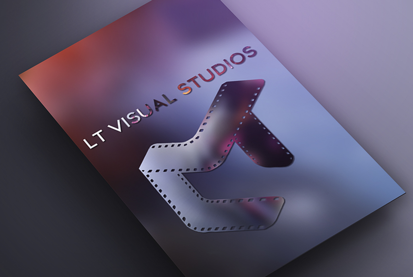
LT Visual Studios


Project details
This was by far the most challenging branding and logo design I have done to date because it was for myself! I wanted the brand to encompass the aesthetics that represent me as a person and my business, which is a little edgy yet still professional and sleek. I also wanted something that was more representative of all of my creative projects; A complete re-branding, as I'm branching out from photography into design and film.
The Idea of the Logo Symbol was to incorporate the letters "LT" with a symbol that represents the brand in a creative manner. After several variations and alterations of the Idea, I decided to combine the “LT” letters(my inititals) with a filmstrip.
The text part of the logo is pretty simple and practical at the same time. The text was created a sleek knockout text on a edgy, graphic background, thus the text in the logo concept is not just the naming, but also integrates into the concept philosophy.
For color, I knew I wanted to use colors in the pink/ purple range, because pinks convey poetry, creativity, self knowledge and originality which are all staples and foundations of my brand. Purples have connections to music and imagination so I felt those colors were spot on for LT Visual Studios.
-
Category :
Branding
-
Client :
LT Visual Studios